Christopher Burke
The mysterious case of the curtailed g:
Danish style in type

ISBN 978-1-9160539-0-8
paperback
240 x 170 mm
40 pages
76 colour and 49 black & white illustrations
out of print
currently unavailable
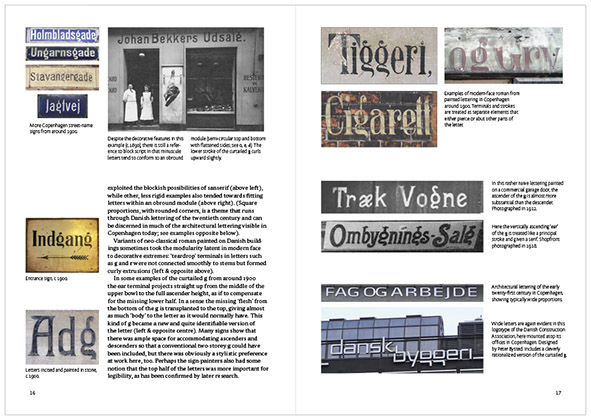
On boarding the train at Copenhagen airport, the type-conscious visitor to Denmark already begins to notice something amiss in the lowercase g used on signs. The city itself offers many more examples of this peculiar g that lacks most of its lower half, both in old street-name signs and in modern brand identities. This form of curtailed g was never exclusive to Denmark, but it seems to have been cultivated there more than anywhere else, and has been consciously adopted by contemporary type designers as a Danish characteristic.
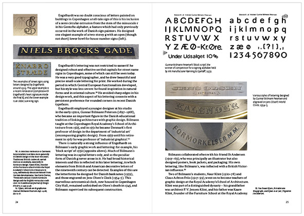
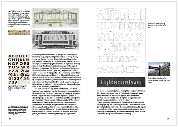
Christopher Burke takes the so-called ‘Danish g’ as a starting point for examining the history of type and lettering in Denmark, where there is a peculiar educational tradition connecting architecture and graphic design. He documents historical figures of importance, such as Knud V. Engelhardt and Gunnar Biilmann Petersen, but also examines the anonymous tradition of public lettering which led to modern, digital typefaces featuring a short g. The book is illustrated in colour throughout.
Contents
Introduction
Prehistory of the open g
Danish typographical history
The modern sign-painting tradition
Interplay between sign painting and typography
Danish lettering in the twentieth century
How the curtailed g became so Danish
Bibliography
[cover photograph by Rasmus Lund Mathisen, cphtype.]